November 21, 2017 From rOpenSci (https://deploy-preview-304--ropensci.netlify.app/blog/2017/11/21/ochre/). Except where otherwise noted, content on this site is licensed under the CC-BY license.
The second rOpenSci OzUnConf was held in Melbourne Australia a few weeks ago. A diverse range of scientists, developers and general good-eggs came together to make some R-magic happen and also learn a lot along the way. Before the conference began, a huge stack of projects were suggested on the unconf GitHub repo. For six data-visualisation enthusiasts, one issue in particular caught their eye, and the ochRe package was born.
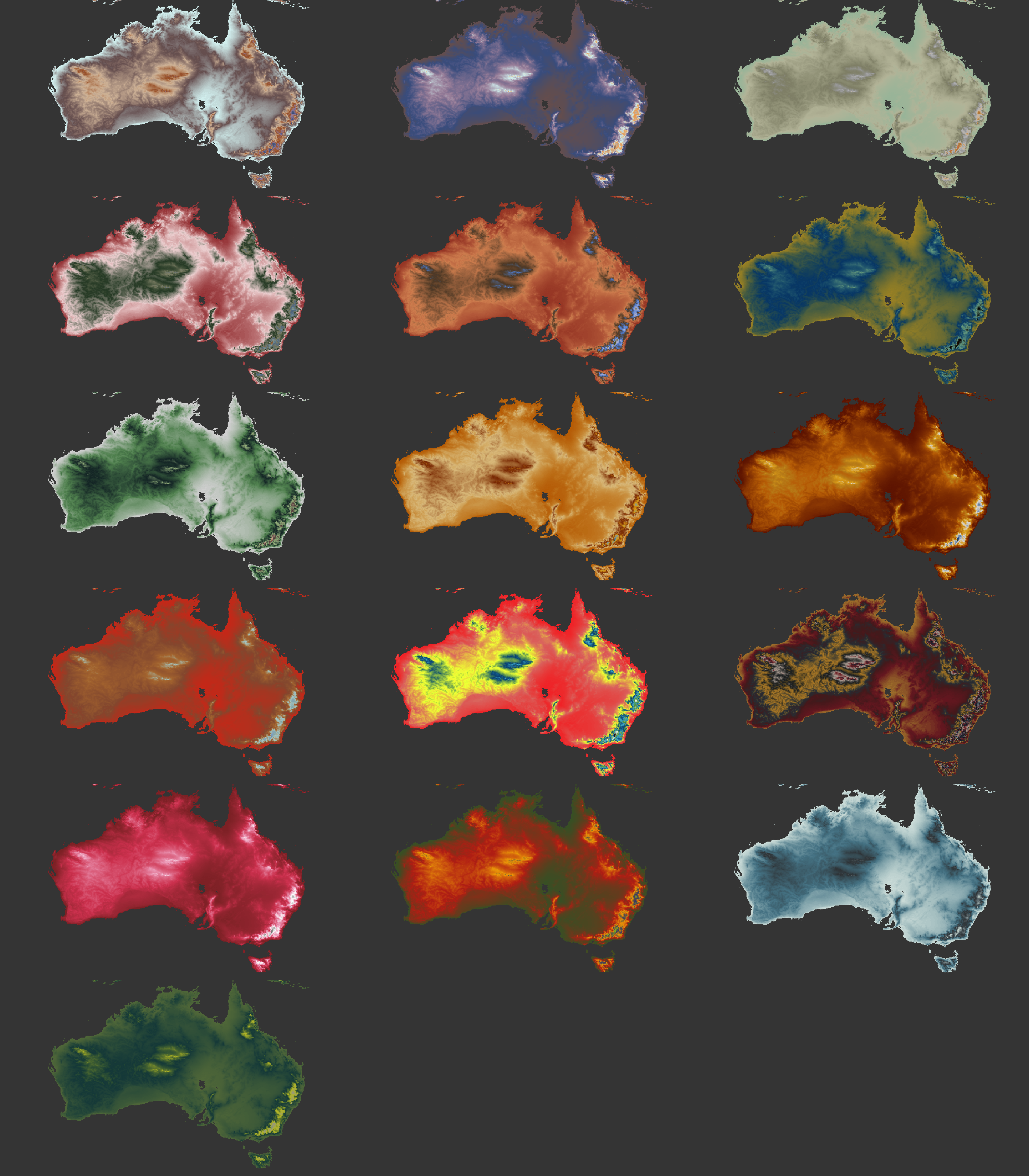
The ochRe package contains colour palettes influenced by the Australian landscape, iconic Australian artists and images. OchRe is originally the brain-child of Di Cook, who was inspired by Karthik Ram’s wesanderson package.
🔗 Why “ochre”?
Naming our package was the “most important” task facing us after all jumping on board the project. Fuelled by a selection of pastries we opened the discussions, fully expecting this to take some time. Fortunately, we all agreed on the name in less than 5 minutes, which meant plenty of pastries were left for the serious business of package building.
Ochre is naturally occuring, brownish-yellow pigment found in many parts of Australia, so frequently in fact, that Australia is sometimes referred to as the “land of ochre soil”. Additionally, ochre pigment has been used for thousands of years by Aboriginal people in Australia, with many culturally important uses from artwork to the preservation of animal skins.
🔗 Building ochRe
We started our package building journey by each picking an iconic Australian artwork (this took longer than you might think). Once we had selected our images, we used the online Image Color Extract PHP demo tool to extract the hex code for the main colours within each image. Some images required a more selective approach, so where needed the colour code extraction was done using the eyedropper tool (in macOS) or the Google Chrome colourPick extension.
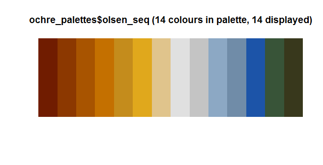
Once we were happy with the colours, codes and order for each palette we loaded this information into ochRe as lists of hex codes associated with the palette name. We adopted scales to improve the fucntionality of the packages when using ggplot, in particular to allow manipulation of colour ramping and transparency. The package also contains a few simple functions for displaying the different palettes.
Below are some examples of original art work and their associated palettes:
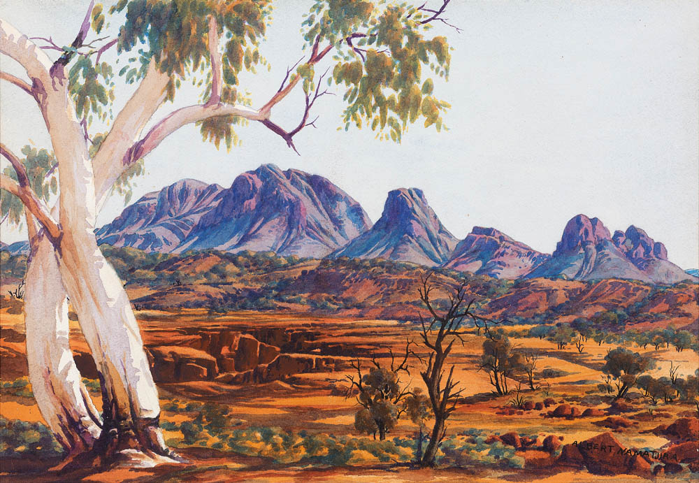
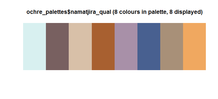
namatjira_qual and namatjira_div are both inspired by the watercolour painting “Twin Ghosts”, by Aboriginal artist Albert Namatjira. namatjira_div is ordered for plotting divergent datasets.
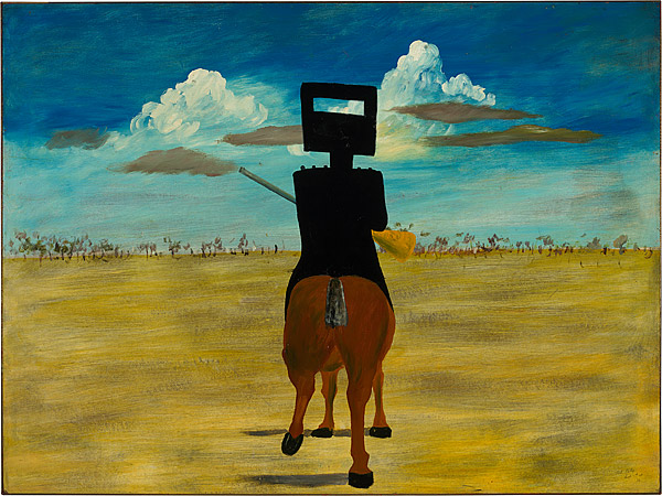
The nolan_ned palette is inspired by the famous paintings of the outlaw Ned Kelly by Sidney Nolan.

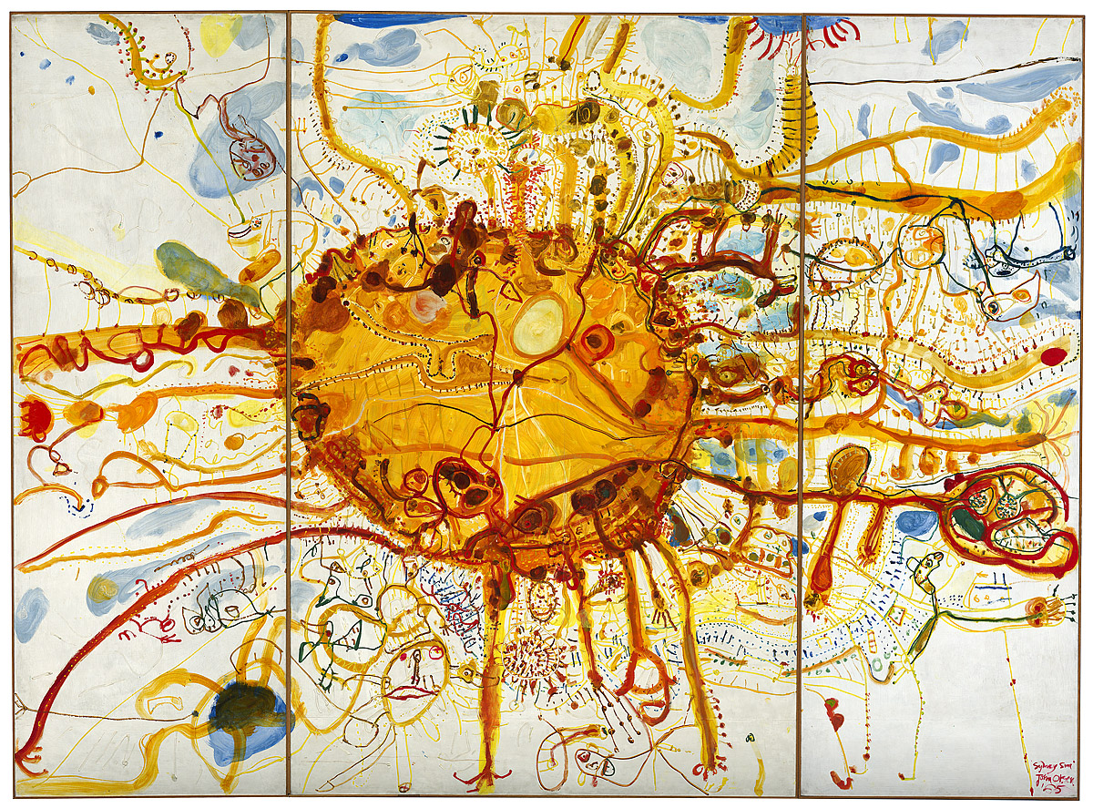
olsen_seq has been designed for plotting sequential data, such as a heat map or landscape layers. The colours come from the abstract piece “Sydney Sun”, 1965, by John Olsen.
There was a high proportion of ecologists at the #ozunconf, which inspired the somewhat pessimistic healthy_reef and dead_reef palettes, with the colours taken from recent underwater photgraphs of the Great Barrier Reef.
🔗
Introducing: ochRe
Our package currently contains 16 colour palettes, each one inspired by either an Australian landscape, an artwork or image by an Australian artist, or an Australian animal. Some of the palettes are more suited to displaying continuous data (such as in the Australian elevation maps above). Other palettes will perform best plotting discrete data (as in the parliament example below).
ochRe can be currently be installed from GitHub:
# You need to install the 'devtools' package first
devtools::install_github("ropenscilabs/ochRe")
You can visualise all 16 palettes using the following code snippet:
pal_names <- names(ochre_palettes)

par(mfrow=c(length(ochre_palettes)/2, 2), lheight = 2, mar=rep(1, 4), adj = 0)
for (i in 1:length(ochre_palettes)){
    viz_palette(ochre_palettes[[i]], pal_names[i])
}
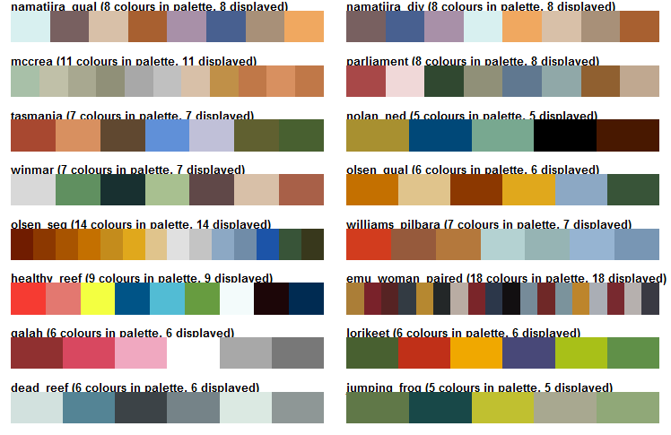
Here are some worked examples, showing how to use the palettes for different types of data visualisation, including both ggplot and base plotting in R.
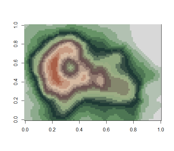
An example using base R and the winmar palette, this is based on an iconic photograph by Wayne Ludbey, “Nicky Winmar St Kilda Footballer”, 1993. In the photo, Aboriginal AFL player Nicky Winmar is baring his skin in response to racial abuse during an AFL game.
## basic example code
pal <- colorRampPalette(ochre_palettes[["winmar"]])
image(volcano, col = pal(20))
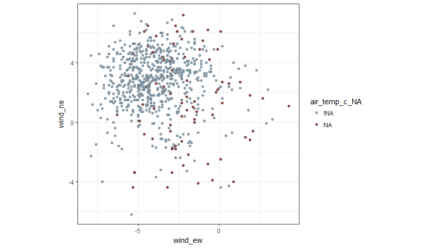
Paired scatter plot using the emu_Woman_paired palette, inspired by “Emu Woman”, 1988-89, by Emily Kame Kngwarreye.
library(tidyverse)
library(ochRe)
library(naniar)

# Exploring missing values benefits from a paired palette, like the emu women
# Here missing status on air temperature is shown in a plot of the two wind variables
data(oceanbuoys)
oceanbuoys <- oceanbuoys %>% add_shadow(humidity, air_temp_c)
ggplot(oceanbuoys, aes(x=wind_ew, y=wind_ns, colour=air_temp_c_NA)) +
    geom_point(alpha=0.8) +
    scale_colour_ochre(palette="emu_woman_paired") +
    theme_bw() + theme(aspect.ratio=1)

# Slightly more complicated, forcing the pairs
clrs <- ochre_palettes$emu_woman_paired[11:12]
ggplot(oceanbuoys, aes(x=wind_ew, y=wind_ns, colour=air_temp_c_NA)) +
    geom_point(alpha=0.8) +
    scale_colour_manual(values=clrs) +
    theme_bw() + theme(aspect.ratio=1)
A map of the Australian electoral boundaries, using the galah palette. Galahs are a common species of cockatoo found throughout mainland Australia.
# Map of the 2016 Australian electoral boundaries
# with the galah palette
library(eechidna)
library(ggthemes)
data(nat_map_2016)
data(nat_data_2016)
ggplot(aes(map_id=id), data=nat_data_2016) +
    geom_map(aes(fill=Area_SqKm), map=nat_map_2016) +
    expand_limits(x=nat_map$long, y=nat_map$lat) +
    scale_fill_ochre(palette="galah", discrete=FALSE) +
    theme_map()

Results of the 2016 Australian election to the senate, coloured by political party using the parliament palette. The colours for this palette were taken from the tapestry by Arthur Boyd found in the Great Hall of Parliament House.
# Election results
senate <- read_csv("http://results.aec.gov.au/20499/Website/Downloads/SenateSenatorsElectedDownload-20499.csv",
                   skip = 1)
coalition <- c("Country Liberals (NT)", "Liberal", "Liberal National Party of Queensland",
               "The Nationals")
labor <- c("Australian Labor Party", "Australian Labor Party (Northern Territory) Branch",
           "Labor")
greens <- c("The Greens", "Australian Greens", "The Greens (WA)")

senate <- senate %>% mutate(PartyNm = ifelse(as.character(PartyNm) %in% coalition,
                                             "Liberal National Coalition", PartyNm))

senate <- senate %>% mutate(PartyNm = ifelse(as.character(PartyNm) %in% labor,
                                             "Australian Labor Party", PartyNm))

senate <- senate %>% mutate(PartyNm = ifelse(as.character(PartyNm) %in% greens,
                                             "Australian Greens", PartyNm))

senate$PartyNm <- factor(senate$PartyNm,
                         levels = names(sort(table(senate$PartyNm),
                            decreasing = T)))

ggplot(data = senate, aes(x = PartyNm, fill = PartyNm)) +
    geom_bar() + xlab("") +
    ylab("") + scale_fill_ochre(palette="parliament") + coord_flip() +
    theme_bw() + theme(legend.position = "None")

For more information about the individual palettes available in ochRe visit our vignette
All of the ochRe team had a great time at #ozunconf, Thank you to the organisers for a brilliant event. Special Thanks to Michael Sumner for providing code to access the Australian elevation map you see at the start of this post.
The Oz colour palette gang soakin it up outside #ozunconf pic.twitter.com/XiLkhwZwTv
— Miles McBain (@MilesMcBain) October 26, 2017

